Selphi Component
0. SDK Mobile baseline requirements
SDK Mobile is a set of libraries (Components) that offer a series of functionalities and services, allowing their integration into a Mobile application in a simple and fully scalable way. Certain components must be installed depending on the use case required. Its high level of modularity allows other new components to be added in the future without affecting those already integrated into the project.
For more information on the base configuration, go to the Getting Started section.
1. Introduction
The Component discussed in the current document is called Selphi Component. It is responsible for capturing a selfie of the user and then extracting the most important facial features. Its main functionalities are the following:
-
Internal camera management.
-
Permission management.
-
Assistant in the process of capturing the user's face.
-
Generation of the templates with the facial characteristics and the image of the user's face for the liveness detection process.
1.1 Minimum requirements
The minimum iOS SDK version required is as follows:
Minimum iOS version: 13
2. Integration of the component
⚠️ Before integrating this component, it is recommended to read the documentation related to Initial Integration and follow the instructions given in that document.
This section will explain step by step how to integrate the current component into an existing project.
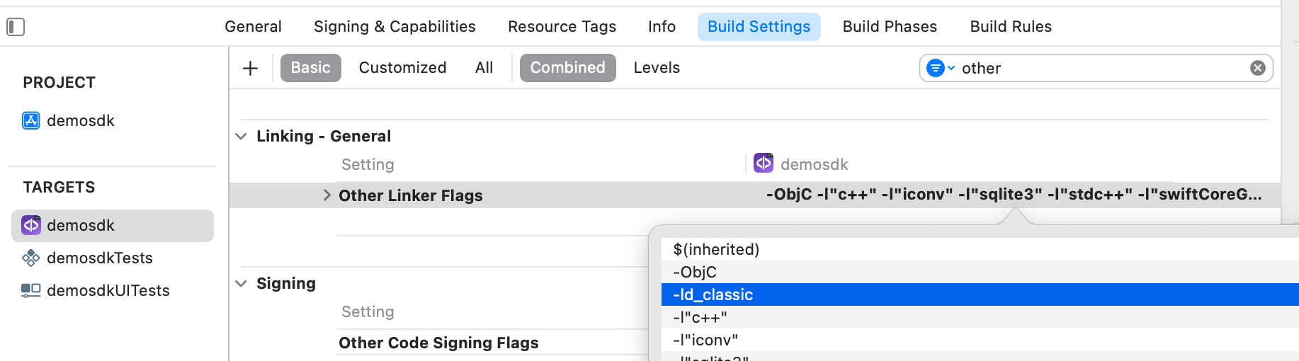
2.1 Dependencies required for integration
⚠️ In order to avoid conflicts and compatibility problems, in case you want to install the component in a project containing an old version of the Facephi libraries. of the Facephi libraries (Widgets), these must be completely removed before the installation of the components. completely before the installation of the components of the SDKMobile components.
2.1.1 Cocoapods
- Currently FacePhi libraries are distributed remotely through different dependency managers, in this case Cocoapods. The mandatory dependencies that must have been previously installed (by adding them in the Podfile file of the project) are:
pod 'FPHISDKMainComponent', '~> 2.6.0'
- To install the current component, the following entry must be included in the Podfile of the project entry in the Podfile of the application:
pod 'FPHISDKSelphiComponent', '~> 2.6.0'
-
Once the dependencies are installed, the different functionalities of the component can be used.
-
In case of development with XCode15 a post-installation script must be included:
2.2.2 SPM
- The mandatory dependencies that must have been previously installed are:
//HTTPS
https://github.com/facephi-clienters/SDK-SdkPackage-SPM.git
//SSH
git@github.com:facephi-clienters/SDK-SdkPackage-SPM.git
- To install the Selphi component, it must be included in the project modules:
//HTTPS
https://github.com/facephi-clienters/SDK-Selphi_component-SPM.git
//SSH
git@github.com:facephi-clienters/SDK-Selphi_component-SPM.git
2.2 Permissions and configurations
In the client application where the components are to be integrated, it is necessary to incorporate the following elements in the Info.plist file.
It is necessary to allow the use of the camera (Privacy - Camera Usage Description).
3. Start new operation
In order to generate the associated information correctly in the platform, the newOperation command must be executed first.
ℹ️ This command must have been executed before launch.
To learn more about how to start a new operation, it is recommended to consult the Start a new operation documentation, which details and explains what this process consists of.
4. Available controllers
| Controller | Description |
|---|---|
| SelphiController | Facial recognition main controller |
| RawTemplateWidgetController | Driver to generate a RawTemplate from an image with the Selphi Widget's function |
| RawTemplateController | Driver to generate a RawTemplate from an image with the FPBTokenizer function |
| SignatureSelphiController | Driver to sign a process with a Capture |
5. Component configuration
To configure the current component, once it has been initialized, a SelphiConfigurationData object must be created and passed as a parameter to the SDKController when the component is launched.
The following section will show the fields that are part of this class and what each is used for.
5.1. Class SelphiConfigurationData
5.1.1 Basic Configuration
resourcesPath
Sets the path to the widget's resource file. This file contains both the graphics resources and the localisation resources. This path must be specified relative to the 'assets' folder of the main application.
showTutorial
This property allows to show the tutorial before the capture process.
showDiagnostic
If set to true, when an error or lack of permissions occurs, the sdk will display a screen with the error returned by the widget.
showResultAfterCapture
Indicates whether or not to display a screen with the captured image of the document after the analysis process. This screen gives the user the possibility to repeat the capture process if the image obtained from the document is not correct.
5.1.2 Advanced Settings
debug
Activation of the debug mode of the component.
fullscreen
Indicates if the view will have priority to be displayed in fullscreen, if the system allows it. fullscreen, if the system allows it.
cropPercent
Allows to modify the crop percentage of the face. The higher the the higher the number, the more the rectangle is cropped with respect to the face. face.
locale
Since version 2.4.X this parameter is no longer configured at component's level. Now it's being done in the initSdk. See Optional parameters in the initSdk.
Forces the widget to use the language setting indicated by the locale parameter. This parameter accepts both a language code (e.g. 'en') and a regional identification code (e.g. 'en_US'). e.g. 'en') and a regional identification code (e.g. 'en_US'). If the widget's resource file did not have a locale for the selected locale' selected, its configuration will fall back to the default language. language.
livenessMode
Sets the liveness mode of the widget. Allowed values are:
-
SelphiFaceLivenessMode.NONE: Indicates that photo detection mode should not be enabled in authentication processes.
-
SelphiFaceLivenessMode.PASSIVE: Indicates that the passive liveness test is performed on the server, by sending the corresponding "BestImage" or "TemplateRaw" for this purpose.
-
SelphiFaceLivenessMode.MOVE: Indicates that the liveness test is active by displaying instructions during the capture, and returning the corresponding result of the process.
stabilizationMode
Sets a stabilisation mode prior to any authentication process in the widget. This mode forces the widget not to start any process if the user is not facing forward and not moving his head.
templateRawOptimized
Indicates whether the template (templateRaw) generated after the selfie should be optimised or not.
qrMode
Boolean indicating whether or not to activate QR reading prior to the authentication process.
videoFilename
Sets the absolute path to the filename where a video of the capture process will be recorded. a video of the capture process will be recorded. The application is responsible for requesting the necessary permissions from the phone in case that path requires additional permissions. requires additional permissions. The widget, by default, will not perform recording process unless a file path is specified using this method. file path is specified using this method.
cameraFlashEnabled
Indicates whether the device's camera flash is enabled.
translationsContent
This advanced property allows, by means of a string in xml format, to configure the translation of the literals displayed during the process. process.
viewsContent
This advanced property allows, by means of a string in xml format, to configure the views of the widget.
5.1.3 Otros parametros
vibrationEnabled
If true, vibration is enabled on errors and if the response of the widget is OK
6. Use of the component
Once the component has been started and a new operation has been created (Section 3), the SDK components can be launched. There are two ways to launch the component:
- [WITH TRACKING] This call allows to launch the functionality of the component, but internal events will be tracked to the tracking server:
let controller = SelphiController(data: selphiConfigurationData, output: { sdkResult in
        // Do whatever with the result
        ...
    }, viewController: viewController)
SDKController.shared.launch(controller: controller)
- [WITHOUT TRACKING] This call allows to launch the functionality of the component, but no event will be tracked to the tracking server:
let controller = SelphiController(data: selphiConfigurationData, output: { sdkResult in
        // Do whatever with the result
        ...
    }, viewController: viewController)
SDKController.shared.launchMethod(controller: controller)
⚠️ The launch method must be used by default. This method allows tracking if your component is enabled and will not be used when it is disabled (or the component is not installed).
On the other hand, the launchMethod method covers a particular case in which the integrator has tracking installed and activated but, in a certain flow within the application does not want to track information. In this case, this method is used to prevent this information from being sent to the platform.
7. Receipt of the result
The controllers will return the required information in SdkResult format. More details in the Result Return section.
7.1. Error's management
finishStatus: Which will tell us if the operation has finished successfully. Possible values:
FinishStatus.STATUS_OK
FinishStatus.STATUS_ERROR
errorType: Specified in a common ErrorType enum:
public enum ErrorType: Equatable, Error {
    //COMMON - BASIC
    case NO_ERROR
    case UNKNOWN_ERROR
    case OTHER(String)

    //COMMON - REQUIREMENTS
    case NO_DATA_ERROR
    case NO_OPERATION_CREATED_ERROR
    case NETWORK_CONNECTION

    //COMMON - PERMISSIONS
    case CAMERA_PERMISSION_DENIED
    case MIC_PERMISSION_DENIED
    case LOCATION_PERMISSION_DENIED
    case STORAGE_PERMISSION_DENIED

    //COMMON - USER'S INTERACTION
    case CANCEL_BY_USER
    case SELPHI_TIMEOUT(LivenessDiagnostic?)

    //COMMON - LICENSE ERROR
    case LICENSE_CHECKER_ERROR(String)
    case MISSING_COMPONENT_LICENSE_DATA
    case COMPONENT_LICENSE_ERROR
    case EMPTY_LICENSE
}
IMPORTANT: SelphiComponent doesn't use the common ErrorType.SDK_TIMEOUT, it uses instead SELPHI_TIMEOUT. This error provides an optional LivenessDiagnostic to give the integrator further information. This Diagnostic provides information if an IAD flag is launched.
The errors 'ErrorType.OTHER' and 'ErrorType.LICENSE_CHECKER_ERROR' are special because they also inform of the error's details.
The String can have this values in the OTHER's case:
public enum SelphiError: String {
    case WIDGET_RESULT_DATA_ERROR
    case INITIALIZATION_ERROR
    case RESOURCES_FILE_NOT_FOUND
    case ACTIVE_LIVENESS_ERROR

    //Widget ERRORS
    case BAD_EXTRACTOR_CONFIGURATION_ERROR
    case BAD_CONFIGURATION_ERROR
    case CONTROL_NOT_INITIALIZED_ERROR
    case EXTRACTION_LICENSE_ERROR
    case HARDWARE_ERROR
    case SETTINGS_PERMISSION_ERROR
    case UNEXPECTED_CAPTURE_ERROR
    case TEMPLATE_ERROR
}
7.2. Receiving successful execution - data
The data field is variable and will depend on which component the result was returned. In the case of this component, the fields returned are as follows:
7.2.1 template
Returns the template that is generated after the extraction process. Valid for the AUTHENTICATION process.
7.2.2 templateRaw
Returns the raw template that is generated after the extraction process. Valid for the AUTHENTICATION process.
7.2.3 bestImageData
Returns the best image extracted from the authentication process in byte array format. This image is the image with the original size extracted from the camera. Valid for the liveness process.
7.2.4 bestImageCroppedData
Returns a cropped image centered on the user's face in byte array format. This image is obtained from the bestImage. This is the image to be used as the characteristic image of the user who performed the process as an avatar.
7.2.5 QrData
Returns the information from the QR reading in String format.
7.2.6 bestImageTokenized
Returns the best image tokenized. Valid for the liveness process.
8. Additional Drivers
8.1. RawTemplateController & RawTemplateWidgetController
Controller to generate a RawTemplate, you can use both the image in base64 and in data .
Example of use:
let controller = RawTemplateController(
	base64: bestImageData.base64EncodedString(),
	output: { sdkResult in
		guard let result = sdkResult.data else {return}
		print(result.base64EncodedString())
	})
SDKController.shared.launchMethod(controller: controller)
or
let controller = RawTemplateController(
	data: bestImageData,
	output: { sdkResult in
		guard let result = sdkResult.data else {return}
		print(result.base64EncodedString())
	})
SDKController.shared.launchMethod(controller: controller)
9. Customizing the component
Apart from the changes that can be made at SDK level (which are explained in the SDK Customization document), this particular component allows the modification of specific animations and texts.
9.1 Customizing the animations
The Selphi Component uses these animations:
public enum Animation : String, CaseIterable {
	case selphi_anim_tip
	case selphi_anim_tip_move
	case selphi_anim_tuto_1
	case selphi_anim_tuto_2
	case selphi_anim_tuto_3
}
The default animations can be overrided by creating a file with the same name and extension (.json for animations) in the app's project.
In addition, the animations can also be decided dynamically on runtime. To do this, you need to create a custom "theme" class that implements ThemeSelphiProtocol's interface:
import selphiComponent
class CustomThemeSelphi: ThemeSelphiProtocol {
	var name: String = "custom"

	public var customBoolean: Bool = true
	var animations: [R.Animation : String] {
		[.selphi_anim_tip: customBoolean ? "primary_custom_selphi_anim_tip": "secondary_custom_selphi_anim_tip",
		 .selphi_anim_tip_move: customBoolean ? "primary_custom_selphi_anim_tip_move": "secondary_custom_selphi_anim_tip_move",
		 .selphi_anim_tuto_1: customBoolean ? "primary_custom_selphi_anim_tuto_1": "secondary_custom_selphi_anim_tuto_1",
		 .selphi_anim_tuto_2: customBoolean ? "primary_custom_selphi_anim_tuto_2": "secondary_custom_selphi_anim_tuto_2",
		 .selphi_anim_tuto_3: customBoolean ? "primary_custom_selphi_anim_tuto_3": "secondary_custom_selphi_anim_tuto_3"]
	}
}
To customise the component, ThemeSelphiManager.setup(theme: CustomThemeSelphi() ) must be called before launching the selphiController:
let selphiController = SelphiController(data: SelphiConfigurationData(), output: { sdkResult in
        // Do whatever with the result
        ...
    }, viewController: viewController)
ThemeSelphiManager.setup(theme: CustomThemeSelphi())
SDKController.shared.launch(controller: selphiController)
9.1.1 Animations guide
- selphi_anim_tip This animation is shown if the livenessMode configuration parameter is not MOVE.
var configSelphi = SelphiConfigurationData()
...
configSelphi.livenessMode = SelphiFaceLivenessMode.PASSIVE
- selphi_anim_tip_move This animation is shown if the livenessMode configuration parameter is MOVE.
var configSelphi = SelphiConfigurationData()
...
configSelphi.livenessMode = SelphiFaceLivenessMode.MOVE
- selphi_anim_tuto_1
- selphi_anim_tuto_2
- selphi_anim_tuto_3
9.2 Texts
The texts can be customized by overriding the value of these keys inside a Localizable.strings. The ones with an _alt suffix are the accesibility label's needed for the voice over functionality to work.
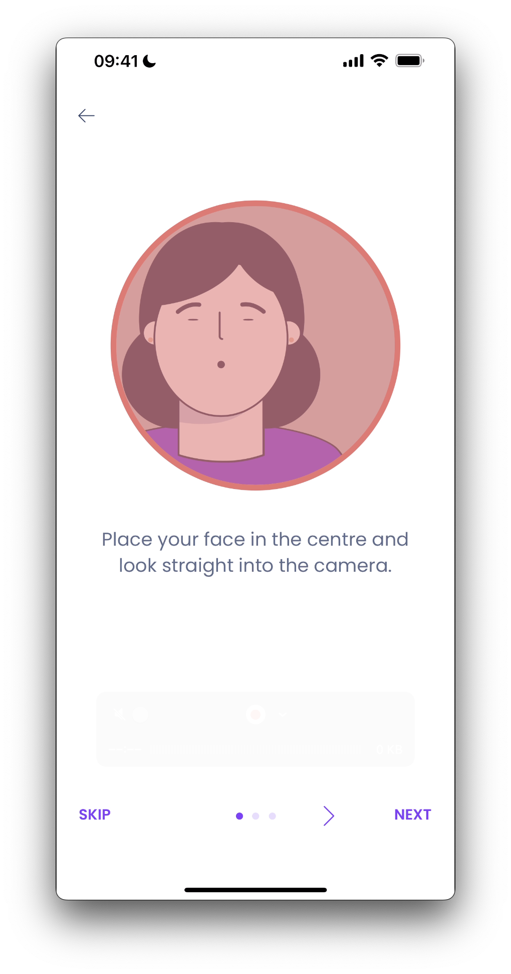
"selphi_component_tutorial_1"="Place your face in the centre and look straight into the camera.";
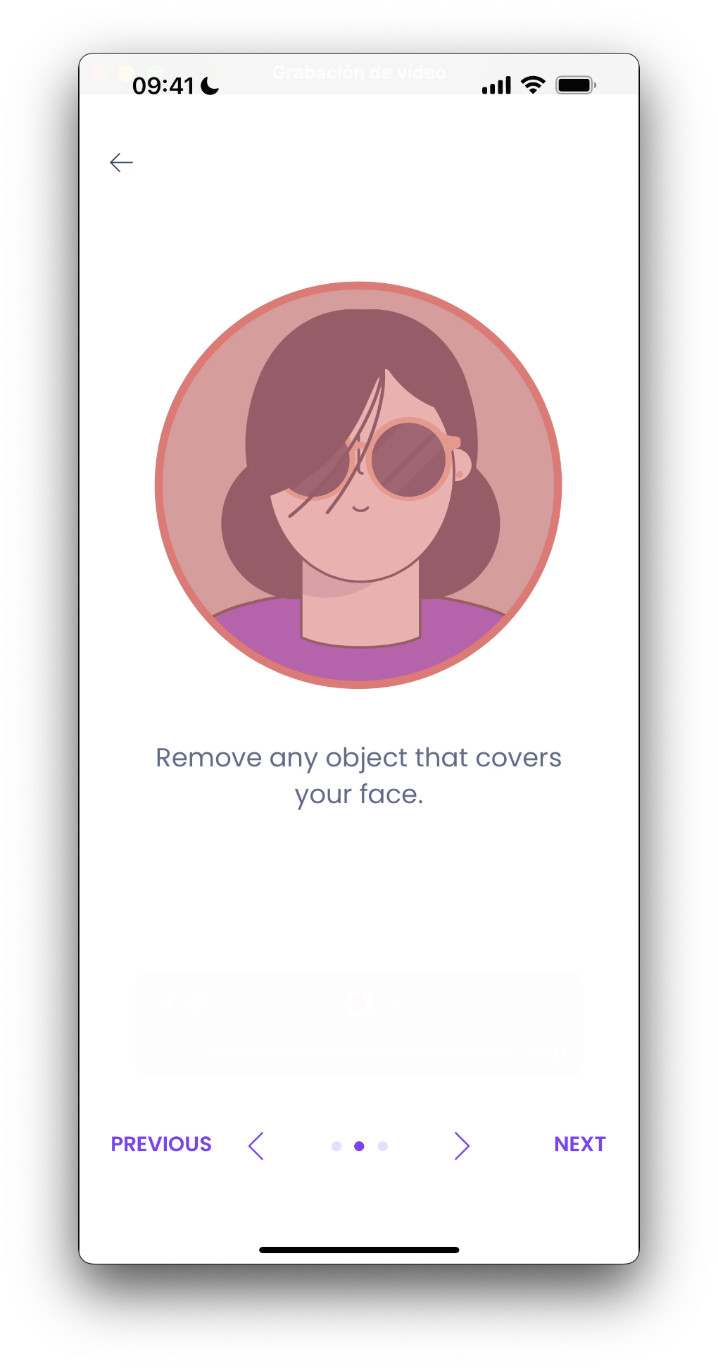
"selphi_component_tutorial_2"="Remove any object that covers your face.";
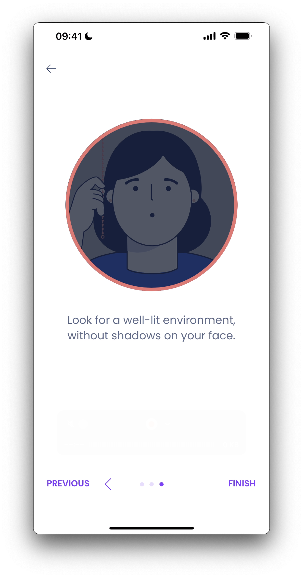
"selphi_component_tutorial_3"="Look for a well-lit environment, without shadows on your face.";
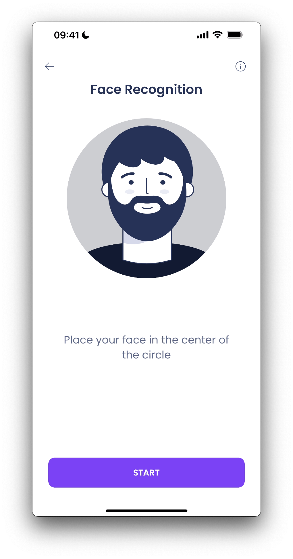
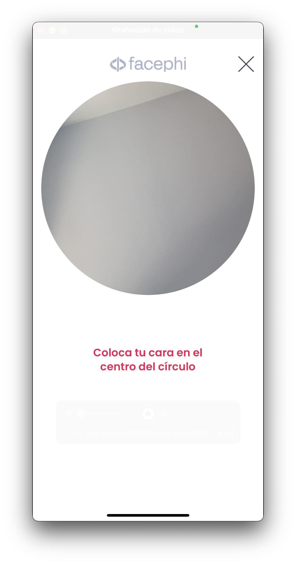
"selphi_component_tip_desc"="Place your face in the center of the circle";
"selphi_component_tip_title"="Face Recognition";
"selphi_component_tip_button_message"="START";
"selphi_component_tip_alt"="Animation of a mobile screen with the front camera activated. A circle appears in the center of the screen. A person shows their face inside the circle and the application takes a photo.";
"selphi_component_tip_move_alt"="Animation of a mobile screen with the front camera activated. A circle appears in the center of the screen. A person shows their face inside the circle, moves it slightly to the side and the application takes a photo of it. ";
"selphi_component_tutorial_1_alt"="A circle appears in the center of the screen. A person shows their face. Their entire head can be seen inside the circle. When they are correctly positioned, the application takes a photo of them.";
"selphi_component_tutorial_2_alt"="A circle appears in the center of the screen. Inside the circle there is a person, wearing sunglasses, and his hair covering part of his face. He takes off his glasses and removes his hair from his face. The application detects your entire face and takes a photo.";
"selphi_component_tutorial_3_alt"="A dark circle appears in the center of the screen. Inside the circle, it is difficult to see a person's face. A light turns on and their face can be clearly seen. After this, the application makes a photo.";
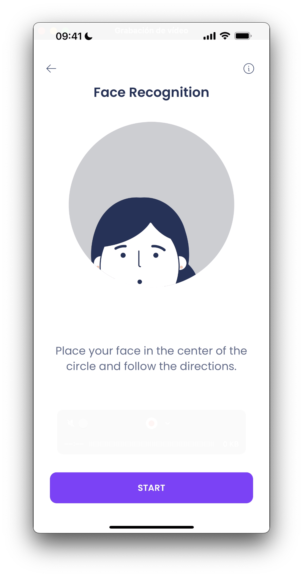
"selphi_component_tutorial_move_desc"="Place your face in the center of the circle and follow the directions.";
"selphi_component_timeout_title" = "Timeout";
"selphi_component_timeout_desc" = "We were unable to identify you. Please try again";
Thus, if you want to modify for example the text "START" of the key selphi_component_tip_button_message for the language en-EN, you must go to the file Localizable.strings in the folder en-EN.lproj if it exists (if not, you must create it) and there, add:
"selphi_component_tip_button_message"="BEGIN";.
If a message is not specified in the language file, it will be filled with the default message.
9.3 Colors, images, dimensions and fonts
The customization of the other elements from previous images is done inside the Status Component.
9.4 Widget Customization
Selphi has two different parts, the first one is the tips and tutorial pages as stated in previous sections. The second one is the capture widget.
This widget can also be customized by following the instructions inside Selphi Resources.