Status Component
1. Introduction
The Component dealt with in the current document is called StatusComponent. It is in charge of the common UI used in the components. This Component can is completely customizable. The elements you can override/change are:
-
Colors
-
Images
-
Dimensions (size values,...)
-
Fonts
1.1 Minimum requirements
The minimum iOS SDK version required is as follows:
Minimum iOS version: 13
2. Integration of the component
⚠️ Before integrating this component, it is recommended to read the documentation related to Initial Integration and follow its instructions.
To use the Status Component with the SDK, it's needed to pass an instance as a param in the initSdk function:
SDKController.shared.initSdk(
        ...,
        statusController: StatusController()
    )
When a StatusController's instance is provided, the Component's will show a tutorial UI, diagnostic screen on errors and more when launched.
2.1. Dependencies required for integration
None
Cocoapods
- Currently FacePhi libraries are distributed remotely through different dependency managers, in this case Cocoapods. The mandatory dependencies that must have been previously installed (adding them in the Podfile file of the project) are:
pod 'FPHISDKMainComponent', '~> 2.6.0'
- To install the Status component, the following entry must be included in the application Podfile:
pod 'FPHISDKStatusComponent', '~> 2.6.0'
- Once the dependencies are installed, the different functionalities of the component can be used.
SPM
- The mandatory dependencies that must have been previously installed are:
//HTTPS
https://github.com/facephi-clienters/SDK-SdkPackage-SPM.git
//SSH
git@github.com:facephi-clienters/SDK-SdkPackage-SPM.git
- To install the Status component, it must be included in the project modules:
//HTTPS
https://github.com/facephi-clienters/SDK-StatusPackage-SPM.git
//SSH
git@github.com:facephi-clienters/SDK-StatusPackage-SPM.git
3. Available controllers
| Controller | Description |
| StatusController | Contains the exposed API methods |
4 Customize
The component's customization is managed with "Themes". This themes implement ThemeStatusProtocol:
public protocol ThemeStatusProtocol {
    var name: String { get } // Description of the theme
    var fonts: [R.Font: String] { get }
    var dimensions: [R.Dimension: CGFloat] { get }
    var images: [R.Image: UIImage?] { get }
    var colors: [R.Color: UIColor?] { get }
}
A custom theme can edit any of those values. By default there is a ThemeStatus that is used when a param is not configured.
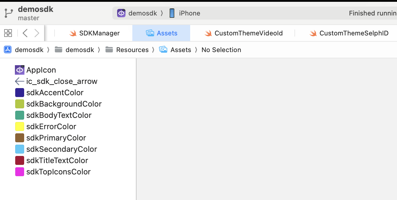
4.1 Colors
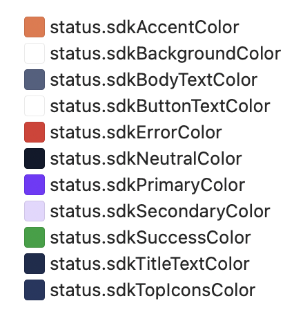
Available colors to customize:
// COMMON SDK Colors
case sdkPrimaryColor
case sdkBackgroundColor
case sdkSecondaryColor
case sdkBodyTextColor
case sdkTitleTextColor
case sdkSuccessColor
case sdkErrorColor
case sdkNeutralColor
case sdkAccentColor
case sdkTopIconsColor
// Phingers Specific Colors
case sdkButtonTextColor
By default:
4.1.1 Customize colors with xcassets
When used, the StatusComponent will check first if a color asset with the same name as the enum's case exists in the main app.
This option overrides the Theme. If the asset is not found in the main app, it will take the value of the configured "Theme".
4.1.2 Customize colors with a Theme
The colors can be customized with the creation of a Theme class:
import statusComponent
...

class CustomThemeStatus: ThemeStatusProtocol {
    ...
    var colors: [R.Color: UIColor?] = [
        R.Color.sdkPrimaryColor: UIColor.red,
        R.Color.sdkBackgroundColor: UIColor.white,
        ...
    ]
}
4.2 Images
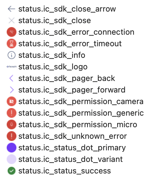
Available images to customize:
enum Image: String, CaseIterable {
    case ic_sdk_close
    case ic_sdk_close_arrow
    case ic_sdk_error_connection
    case ic_sdk_error_timeout
    case ic_sdk_unknown_error
    case ic_sdk_permission_camera
    case ic_sdk_permission_micro
    case ic_sdk_permission_generic
    case ic_sdk_logo
    case ic_sdk_info
    case ic_status_success
    case ic_status_dot_primary
    case ic_status_dot_variant
    case ic_sdk_pager_back
    case ic_sdk_pager_forward
}
By default:
4.2.1 Customize images with xcassets
When used, the StatusComponent will check first if an image asset with the same name as the enum's case exists in the main app.
This option overrides the Theme. If the asset is not found in the main app, it will take the value of the configured "Theme".
4.2.2 Customize images with a Theme
The images can be customized with the creation of a Theme class:
import statusComponent
...

class CustomThemeStatus: ThemeStatusProtocol {
    ...
    var images: [R.Image: UIImage?] = [
        R.Image.ic_sdk_close_arrow: UIImage(named: "custom_arrow_icon"),
        ...
    ]
}
4.3 Fonts
Available fonts to customize:
enum Font: String {
    case regular
    case bold
}
By default:
public var fonts: [R.Font: String] {
    [.bold: "Poppins-SemiBold",
     .regular: "Poppins-Regular"]
}
Poppins-Regular
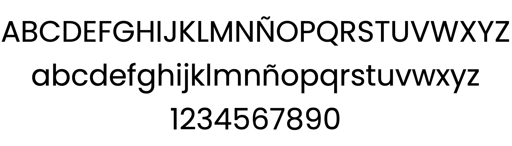
Poppins-SemiBold
4.3.1 Customize fonts
The fonts can be customized with the creation of a Theme class:
import statusComponent
...

class CustomThemeStatus: ThemeStatusProtocol {
    ...
    var fonts: [R.Font: String] = [
        .bold: "Comic Sans Bold"
    ]
}
⚠️ If using a custom font: The font needs to be registered before launching the component. Every ThemeManager registers its fonts, but this operation is asynchronous and can cause race conditions. While using custom fonts, it's advised to call to the ThemeManager.setup(...) as soon as possible.
4.4 Dimensions
Available dimensions to customize:
enum Dimension: CGFloat {
    case fontExtraSmall
    case fontSmall
    case fontRegular
    case fontLarge
    case fontExtraLarge
    case radiusCorner
    case radiusCornerSmall
    case outlinedBorderWidth
}
By default:
public var dimensions: [R.Dimension : CGFloat] {
        [.fontExtraSmall: 16,
         .fontSmall: 18,
         .fontRegular: 20,
         .fontLarge: 24,
         .fontExtraLarge: 32,
         .radiusCorner: 30,
         .radiusCornerSmall: 12,
         .outlinedBorderWidth: 1]
4.4.1 Customize dimensions
The dimensions can be customized with the creation of a Theme class:
import statusComponent
...

class CustomThemeStatus: ThemeStatusProtocol {
    ...
    var dimensions: [R.Dimension: CGFloat] = [
        .fontBig: 8,
        R.Dimension.radiusCorner: 5,
        ...
    ]
}
4.5 Texts - Multi-Language
4.5.1 Default language settings
If the package is installed via SPM, for text localization to work, the following needs to be added to the Info.plist file of the integrator app:
CFBundleAllowMixedLocalizations = YES.
It would look like this:
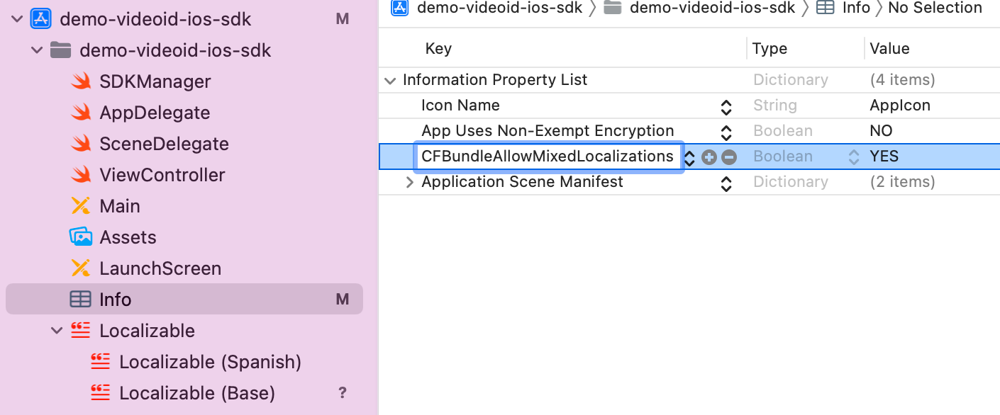
-
English - Spain
-
Spanish - Spain
-
Portuguese - Portugal
The component's language can be configured with the locale parameter of the initSdk function. If not configured, by default, the SDK chooses the established lnaguage of the device.
-
If the language is any language whose root is Spanish (e.g. Spanish - Mexico), by default, it will use Spanish - Spain.
-
If the language is any language whose root is Portuguese (e.g. Portuguese - Brazil), by default, it will use Portuguese - Portugal.
-
For any other case, English will be used.
4.5.2 Customized Language Configuration
The component allows the customization of texts according to the language, which as in the previous case, will be defined by the language that is selected on the device.
This customization applies to new localizations as well as to the case of the default languages (es, en and pt-PT). It is done through the use of Localizable.strings. files.
4.5.3 Keys for multi-languages
The texts can be customized by overriding the value of these keys inside a Localizable.strings. The ones with an _alt suffix are the accesibility label's needed for the voice over functionality to work.
"sdk_network_connection_desc"="Check that your connection is stable and try again.";
"sdk_network_connection_title"="Check your internet connection.";
"sdk_retry_button_message"="RETRY";
"sdk_finish_button_message"="FINISH";
"sdk_timeout_desc"="";
"sdk_timeout_title"="Time exceeded";
"sdk_unknown_desc"="";
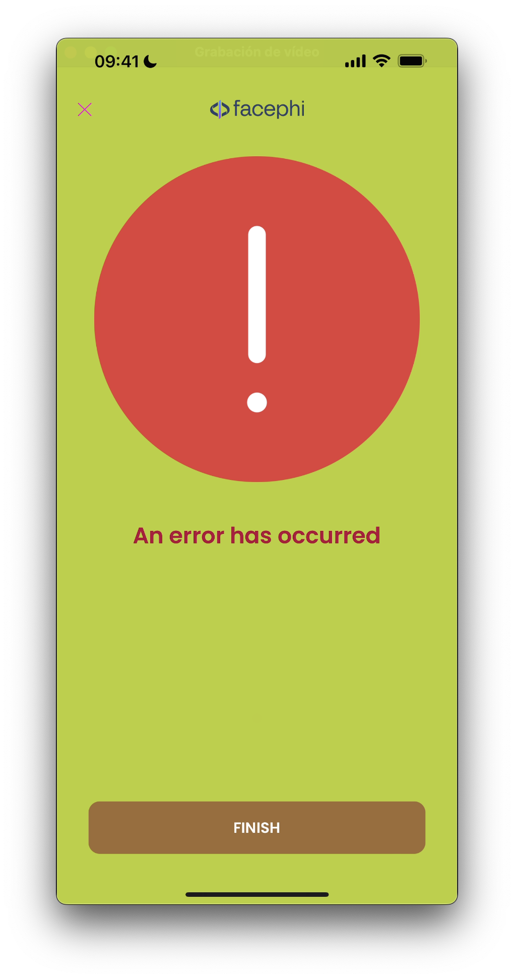
"sdk_unknown_title"="An error has occurred";
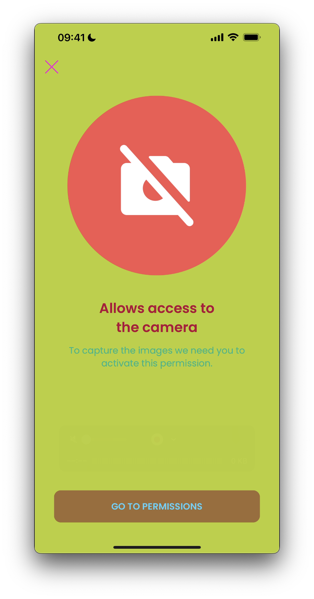
"sdk_permissions_camera_title"="Allows access to the camera";
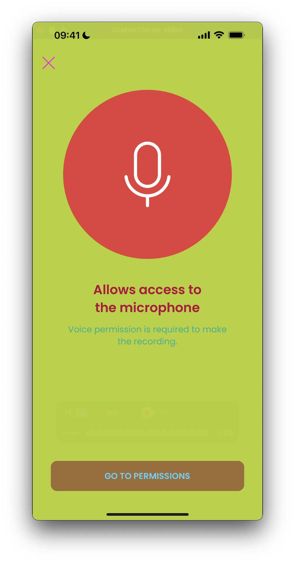
"sdk_permissions_microphone_title"="Allows access to the microphone";
"sdk_permissions_microphone_desc"="Voice permission is required to make the recording.";
"sdk_permissions_camera_desc"="To capture the images we need you to activate this permission.";
"sdk_permissions_settings_message"="GO TO PERMISSIONS";
"sdk_tutorial_skip_button_message"="SKIP";
"sdk_tutorial_next_button_message"="NEXT";
"sdk_tutorial_previous_button_message"="PREVIOUS";
"sdk_tutorial_finish_button_message"="FINISH";
"sdk_exit_alert_question" = "Are you sure you will finish the process?";
"sdk_exit_alert_cancel" = "Cancel";
"sdk_exit_alert_finish" = "Finish";
"sdk_exit_alert_accept" = "Accept";
"sdk_close_alt" = "Close";
"sdk_back_alt" = "Back";
"sdk_tutorial_alt" = "Tutorial";
"sdk_tutorial_skip_button_alt"="Skip";
"sdk_tutorial_next_button_alt"="Next tip";
"sdk_tutorial_previous_button_alt"="Previous tip";
"sdk_tutorial_finish_button_alt"="Finish";
Thus, if you want to modify for example the text "Finish" of the key sdk_exit_alert_finish for the language en-EN, you must go to the file Localizable.strings in the folder en-EN.lproj if it exists (if not, you must create it) and there, add:
"sdk_exit_alert_finish"="End";.
If a message is not specified in the language file, it will be filled with the default message.
4.6 Full Example
A full example of a CustomThemeStatus could be:
import statusComponent

class CustomThemeStatus: ThemeStatusProtocol {
    var name: String {
        "custom"
    }

    var images: [R.Image: UIImage?] = [
        R.Image.ic_sdk_close_arrow: UIImage(named: "custom_arrow_icon"),
        // If the rest is not configured, only the ic_sdk_close_arrow is overrided and customized
    ]

    var colors: [R.Color: UIColor?] = [
        R.Color.sdkPrimaryColor: UIColor.red,
        R.Color.sdkBackgroundColor: UIColor.white,
    ]

    var dimensions: [R.Dimension: CGFloat] = [
        .fontBig: 8,
        R.Dimension.radiusCorner: 5,
    ]
    var fonts: [R.Font: String] = [
        .bold: "Comic Sans Bold"
    ]
}
Once implemented, we set the instance of our custom theme like this:
import statusComponent
...
ThemeStatusManager.setup(theme: CustomThemeStatus())
...
5. Working Example
There are four different views inside Status that can be configured.
Aside from using a theme, the customization can be done with the assets approach. In this example, we can see the result of creating the following keys and values:
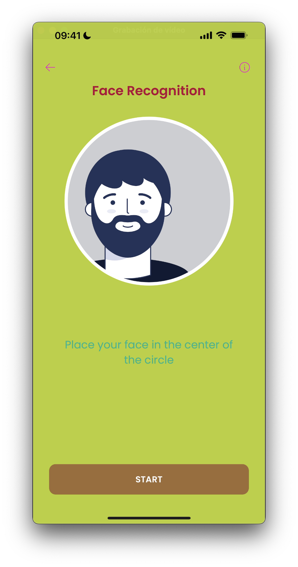
5.1 Tip View
The tip is activated by default but can be skipped with the controller's configuration parameter showTutorial.
Usually it's the first page the user will see after launching the Controller.
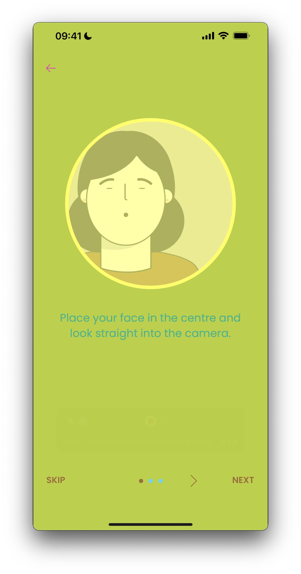
5.2 Tutorial Views
The tutorial is accessed by the More Information button in the Tip. It's a set of views that further explain the process to the user.
5.3 Diagnostic View
The Diagnostic view is shown to the user when there is information needed to continue the process.
5.4 Permission View
Similar to Diagnostic view. It's shown when the capture process needs the user's approval to access some of the device's features. The difference is that this view contains a button that navigates to the device settings.
Missing Camera Permissions
Missing Microphone Permissions